Thursday 30 March 2017
Monday 20 March 2017
Sunday 19 March 2017
question 6 draft
Photoshop –
Photoshop is a software that I used to format my magazine
front cover, contents and double page spread. I took images and text and placed
them so that it came out with my final product. In Photoshop, I had to teach
myself skills of how to crop, resize, order layers, place, reatrersize, spot
healer, blur, use rulers, and also arrange photos so that they fit with my
genre (simplistic). To teach myself how to use these, I watched videos,
inquired my peers, asked friends and taught myself.
Blogger –
Blogger is website that I have used to
upload tasks and blog posts. It is a really useful way of uploading as peers
can view whenever they want and keep up to date with my posts. Blogger also
allowed me to embed codes so that different platforms could be available to view
on my blog. Platforms such as, slideshare, scribd, soundcloud, Canva, etc.
These different platforms allowed me to show off my skills which is a helpful
thing that blogger allowed me to do.
Question 1
My magazine follows conventions of regular simplistic
magazines that occur in the media. For instance, DIY, Fader and i-D. They are
simplistic due to them not having much writing on them. The
font that is used for all these magazines are simple and,
clear and mostly in white. I chose my font to be in black because the
background was a light grey colour and the white may have blended into the
background. My masthead is at the top like the magazine examples. However,
their mastheads are not behind the image like it is on my magazine. It is a
convention to have a masthead behind an image on a magazine front cover but
these magazines have not included this; I would not call this conventional as
it’s conventional either way.
My magazine follows conventions such as margins, text size,
format
/layout, etc.
The margins on
conventional magazines are just slightly off to the edge of the page. My
magazine does the same, this makes the page look neater and it so that the
words do not run to the edge of the page. The layout of regular magazines like
the one above has connotations to the layout of my magazine. The masthead is
placed at the top and to the left in the professional magazines. On mine, it is
centred; this isn’t unconventional because many other magazines have their masthead
in the centre too. Most other magazines have the artist’s name or a play – on
word on the front cover; therefore, I chose to go with “it’s the golden boys”
for my front cover. This is because these are lyrics that are in a song that
fits in the genre that my magazine is. If my audience knows what this is, then
they may be attracted to read this magazine as they could associate the song
that they like with the magazine or the artist presented on the front cover.
Another reason my magazine is conventional is because the barcode is at the bottom
right of the page. In general, most conventional magazines have their barcode
at the bottom right of the page so I therefore decided to do the same to make
my magazine conventional
Saturday 18 March 2017
Thursday 16 March 2017
Wednesday 15 March 2017
Saturday 11 March 2017
Wednesday 8 March 2017
Photographers


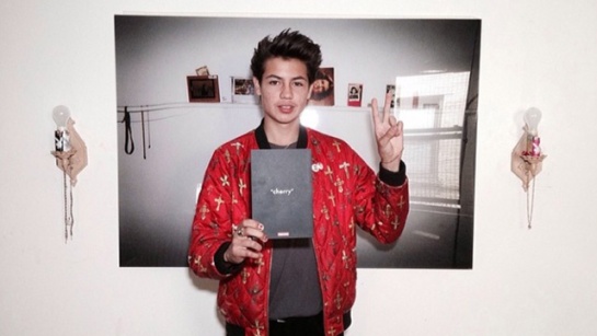
Charlotte Patmore
is a photographer who takes photos of alternative artists such as Dream Wife,
Black Honey, King Krule, etc. I am interested in her photography because she
takes different styles of photos. Some of Patmore’s photos look like they are
vintage and others are in black and white, others look like standard camera
photos. I am interested in Patmore’s photography because she takes photos of
artists I am interested in and her variety of images means that I don’t get
bored of the same images over and over again. I am interested in taking photos
like the one above because there is a variety of styles she chooses.
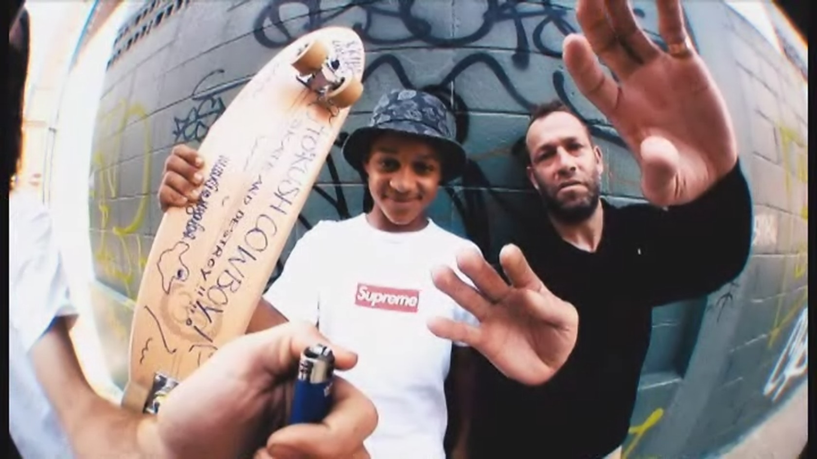
William Strobeck


Monday 6 March 2017
Friday 3 March 2017
Thursday 2 March 2017
Subscribe to:
Posts (Atom)


