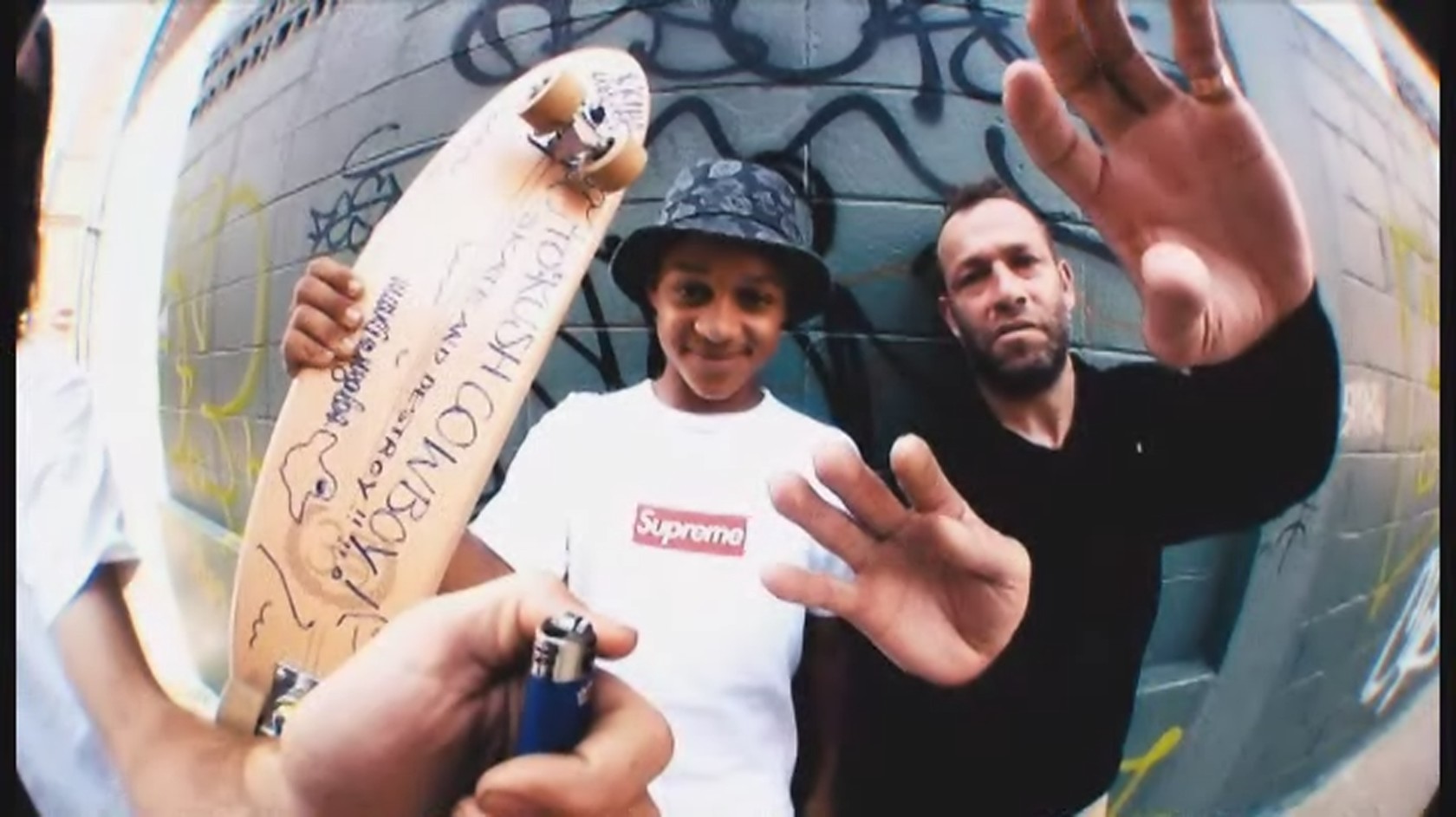
Friday 7 April 2017
Thursday 6 April 2017
Evaluation question 6
6. What have you
learnt about technologies from the process of constructing this product?
Photoshop –
Photoshop is a software that I used to format my magazine
front cover, contents and double page spread. I took images and text and placed
them so that it came out with my final product. In Photoshop, I had to teach
myself skills of how to crop, resize, order layers, place, reatrersize, spot
healer, blur, use rulers, and also arrange photos so that they fit with my
genre (simplistic). To teach myself how to use these, I watched videos,
inquired my peers, asked friends and taught myself.

Blogger –
Blogger is website that I have used to
upload tasks and blog posts. It is a really useful way of uploading as peers
can view whenever they want and keep up to date with my posts. Blogger also
allowed me to embed codes so that different platforms could be available to view
on my blog. Platforms such as, slideshare, scribd, soundcloud, Canva, etc.
These different platforms allowed me to show off my skills which is a helpful
thing that blogger allowed me to do.

Camera
–
D3200 is the camera I used to take my images and I learnt to
place subjects in the middle of my shots that I took so that the reader knew
where to look straight away. I also learnt how take the photos so that the
subjects were well lit ad I did this by placing lamps directed at the subjects
and this made the subjects turn out well lit.

Soundcloud –
Soundcloud is a format where you can upload audio files. I
used this to answer one of my questions and I learnt how to keep calm when
recording myself. I also had to embed a link from soundcloud into blogger. Using
soundcloud allowed me to broaden my range of platforms that I used.

In
the past, during GCSE, I used these platform just briefly. This gave me an
insight into what I needed to do when I started these questions and blogposts.
This made it easier for me and furthered my knowledge.
Wednesday 5 April 2017
Evaluation question 4
4. Who would be the
audience for your media product?
I have chosen 16-26 year olds for the target audience for my
magazine because my magazine looks at alternative/indie genre and I feel as
though the music is quite mature so it targets towards adults (18-26) but also
mature 16-18 year olds would listen to the indie/punk genre.
In my planning, I looked on UK Tribes for an audience that I
wanted to target my magazine for. I chose the categories, “Scenesters” and
“Stylers” because I feel as though they would be interested in the kind of
things that would be included in my magazine. More specifically, the Scenesters
would be interested in my magazine because the description for Scenesters is
that they incorporate fashion and music into trends and their interests. My
magazine would feature artists wearing trendy clothes as well as artists that
are partially famous for their clothes. For example, Tyler The Creator (Golf
Wang), Laurie Vincent (YLC Clothing), etc.
The other UK Tribes category I chose is “Stylers”. The
reason I chose Stylers was because I believe they will like my magazine because
my magazine would feature many different trends. One of the descriptives used
for Styler is that they “Stay ahead of the cool” and my magazine will feature
trends that will stay ahead of the cool. Also, “inspiration for the youth of
today” is part of their description so for these to read my magazine may be
inspirational to others o also read my magazine.
My audience would have to versatile in terms of their music
taste. Although their music taste will be part of the indie/alternative
bracket, it would be helpful for my target audience to enjoy the music of rap.
Artists like MF DOOM, Rejjie Snow, Loyle Carner and Danny Brown would also be
included in my magazine so my audience may not enjoy this music if they are not
versatile and only listen to indie music. Not only the rap sides of things, but
other artists that have their own partcualr genre would also be thrown in my
magazine. Artists like Xxxtentacion, Grimes and Alfa Mist who have created
their own audience their own audience would appear in my articles; so,
therefore, my audience would have to like a broad range of music to enjoy
articles in magazine. Needless to say, they would also have to be into music
quite heavily to listen to some of the other Niche artists that would be
included.
In conclusion, my magazines would have to be ahead of the
fashion game and be incredibly trendy. Would also have to be into niche artists
and be quite versatile. This can be related to the indie audience because they
notoriously enjoy niche and unheard artists. Indie and alternative audiences also
would have a versatile taste I music which fits my criteria.
This is my written answer to my evaluation question 4, I recorded my voice and uploaded to recording to Soundcloud.
Thursday 30 March 2017


Monday 20 March 2017
Sunday 19 March 2017
question 6 draft
Photoshop –
Photoshop is a software that I used to format my magazine
front cover, contents and double page spread. I took images and text and placed
them so that it came out with my final product. In Photoshop, I had to teach
myself skills of how to crop, resize, order layers, place, reatrersize, spot
healer, blur, use rulers, and also arrange photos so that they fit with my
genre (simplistic). To teach myself how to use these, I watched videos,
inquired my peers, asked friends and taught myself.
Blogger –
Blogger is website that I have used to
upload tasks and blog posts. It is a really useful way of uploading as peers
can view whenever they want and keep up to date with my posts. Blogger also
allowed me to embed codes so that different platforms could be available to view
on my blog. Platforms such as, slideshare, scribd, soundcloud, Canva, etc.
These different platforms allowed me to show off my skills which is a helpful
thing that blogger allowed me to do.

Question 1
My magazine follows conventions of regular simplistic
magazines that occur in the media. For instance, DIY, Fader and i-D. They are
simplistic due to them not having much writing on them. The
font that is used for all these magazines are simple and,
clear and mostly in white. I chose my font to be in black because the
background was a light grey colour and the white may have blended into the
background. My masthead is at the top like the magazine examples. However,
their mastheads are not behind the image like it is on my magazine. It is a
convention to have a masthead behind an image on a magazine front cover but
these magazines have not included this; I would not call this conventional as
it’s conventional either way.
My magazine follows conventions such as margins, text size,
format
/layout, etc.
The margins on
conventional magazines are just slightly off to the edge of the page. My
magazine does the same, this makes the page look neater and it so that the
words do not run to the edge of the page. The layout of regular magazines like
the one above has connotations to the layout of my magazine. The masthead is
placed at the top and to the left in the professional magazines. On mine, it is
centred; this isn’t unconventional because many other magazines have their masthead
in the centre too. Most other magazines have the artist’s name or a play – on
word on the front cover; therefore, I chose to go with “it’s the golden boys”
for my front cover. This is because these are lyrics that are in a song that
fits in the genre that my magazine is. If my audience knows what this is, then
they may be attracted to read this magazine as they could associate the song
that they like with the magazine or the artist presented on the front cover.
Another reason my magazine is conventional is because the barcode is at the bottom
right of the page. In general, most conventional magazines have their barcode
at the bottom right of the page so I therefore decided to do the same to make
my magazine conventional
Saturday 18 March 2017

Thursday 16 March 2017


Wednesday 15 March 2017


Saturday 11 March 2017


Wednesday 8 March 2017
Photographers


Charlotte Patmore
is a photographer who takes photos of alternative artists such as Dream Wife,
Black Honey, King Krule, etc. I am interested in her photography because she
takes different styles of photos. Some of Patmore’s photos look like they are
vintage and others are in black and white, others look like standard camera
photos. I am interested in Patmore’s photography because she takes photos of
artists I am interested in and her variety of images means that I don’t get
bored of the same images over and over again. I am interested in taking photos
like the one above because there is a variety of styles she chooses.
William Strobeck


Monday 6 March 2017

Friday 3 March 2017


Thursday 2 March 2017


Monday 27 February 2017
target audience questionnaire
Name:
___________________________________________
Age: ____
Gender:
________________
Which of the
following magazines do you read or have heard of? Please circle
NME DIY Rolling Stone ID
Q Glamour Mojo
Kerrang! Clash
Other? Please state ____________________
What brands do you
like? Please circle
Gym king Nike Fucking Awesome/FA Skate Moncler
Mulberry Zara SikSilk
Missguided Comme
Des Garcons Supreme Champion Kappa
Doc Marten
SEX skateboards
Palace RIPNDIP
What Music genres do
you enjoy listening to the most? Please
circle
Jazz Hip-hop Rock
Alternative Folk Grime
Pop Classical Heavy metal Electronic
Motown Northern soul EDM
R&B Rap Trap
What artists do you
like? Please circle
The Magic Gang
Slipknot Little Mix Tyler The Creator Jason Derulo The Streets
The Enemy DJ
Khaled FIDLAR Xxxtentacion Slaves
Nicki Manaj 21 Savage
Moose Blood MF
Doom Mac Demarco Skepta
What do you do for
fun? Please describe
_________________________________________________________________
_________________________________________________________________
_________________________________________________________________
Do you go to
gigs/concerts? Please circle
Yes No
If “yes”, what do you
do at them? Please circle
Mosh Stand Sit
Dance
Other? Please state
_______________________________________________
__________________________________________________________________
Do you go to
festivals? Please circle
Yes No
How often would you
buy a magazine? Please circle
Daily Weekly Monthly
Yearly
Other? Please state ___________________________
What is the maximum
you would pay for a magazine? Please
circle
I wouldn’t £2 £5
£8 £12
Other? Please state ______
This is the audience questionnaire I handed to 25 people. I then reviewed the questionnaires and it turned out that my target audience picked out some of the more indie genre of answers so therefore i will target my magazine at a indie audience.
Saturday 25 February 2017
Analysis of existing magazine titles
Analysis of existing magazine titles
Mojo
magazine has a simplistic font with a shadow to the back of it. It looks as
though it may be from the 80s which makes sense as mojo has done magazines of
artists like David Bowie, The Beatles, The Smiths, etc. the fact that Mojo
still uses this font may be because it’s reminiscent to the audience that read
Mojo during the 80s; linking the font back to the 80s is a technique that can
have a nostalgic effect on the older audience.


DIY is a very simplistic title and is in the same place for every issue of it. The fact that is in the same place makes the magazine recognisable to an audience who see the title every time they see DIY. The fact it’s so simple and smaller than other magazine titles makes it so DIY can put their title in most places on the front image.


Clash’s font is simplistic. Subtly, Clash has
put the left side of the ‘A’ over the right side of the ‘L’. Although this may be
hard to notice. or a reader, it adds a bit more to the title and therefore
makes it individual. The title of Clash may look similar to other titles but
this makes it stand out and makes it different.


Kerrang’s
masthead is busy and
perhaps the opposite of some of the simplistic mastheads. Kerrang is a rock and
heavy metal magazine which may suggest why it has such busy front covers
because stereotypically, metal and rock fans are sporadic, messy characters so
for their magazines to reflect this makes sense. I may want to think about how
my masthead reflects my target audience like kerrang does.


Subscribe to:
Posts (Atom)